Design can make or break your next landing page, email, brochure or critical communication. It can mean the difference between getting your point across, making the sale or completely missing the mark. To help you on your way, we’ve put together a few tips and tricks — for designers and non-designers alike — to help with any document layout:
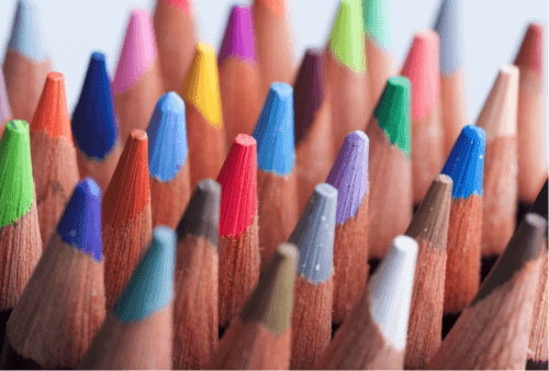
Don’t Use Too Many Colors or Typefaces
Unless you want your layout to look like the Las Vegas skyline, you’ll want to keep the number of typefaces and colors you use to a minimum. One way to limit your fonts and colors is to begin with the basics. Start with 1-2 typefaces and do your entire layout in black and white. Then, add a few colors, images and logos. You can also use color to emphasize calls to action and specific sections on the page.
Complement and Contrast
It’s the reason why dark headlines disappear on dark photos and why light blue and dark brown is a popular color combination. If you want a layout that’s aesthetically pleasing, and legible, stick with colors that complement and contrast. Not sure what colors go together? Use your company logo or a specific image as a starting point, or consult a color wheel for guidance.
Give Your Empty Spaces Purpose
Whitespace or negative space is one of the most important elements of the page. Use it to organize your content and it will make everything look clean and uncluttered. Sprinkle in a little more to give your layout a more sophisticated, classic look.
Keep It Readable
There’s a reason why typefaces like Helvetica, Futura, Garamond and Times New Roman are so popular — they’re readily available and they’re easy to read. So when in doubt, stick with what you know. Also, consider the medium. While serif fonts (fonts with finishing lines or strokes at the top and bottom of letters) and endless streams of copy are great for books, sans-serif fonts and shorter paragraphs with scannable headings are more appropriate for the web.
Emphasize What’s Important
Whether you’re designing a flyer, letter or billing statement, you’ll want to consider the information hierarchy of every page. First, think about how people will read your content as you’re putting together your layout. Will they expect to see the most important thing first or last? How can you use font size and thickness to make the most important words matter? Should you use color to highlight a call to action or the total amount due? No matter what techniques you use, they should always answer to the hierarchy.
Line It Up
Good alignment is basically invisible. Content is grouped and organized in a logical way. The left margin matches the right, the top margin matches the bottom and everything is lined up — as if it were placed on an invisible grid. While it’s okay to break alignment to create tension or draw attention to something on a page, it’s generally better to learn the rules before you break them. Layouts that break alignment often look sloppy and disorganized if not done with much consideration.
One of the best things about the Expresso® Communications Management Platform, is that you can create professionally designed communications in minutes. You start with a library of templates that have been created with all of your communication needs in mind. Just select one, make a few changes, and press a button to send.
Are you ready to streamline the entire document layout creation and approval process? Contact the team at Nordis Technologies for a full demo of Expresso®.