The customer experience is at the center of what we do. That means one of Nordis’ business cornerstones is your satisfaction throughout the entire lifecycle of your communications and payments experience. With your satisfaction in mind, we have updated the look and feel of Expresso®.
On June 21, we debuted Expresso 6.0 – all the features and functionality our customers love, now with a design update. Freshening the user interface didn’t affect workflow or functions. It’s a sharper look, and the changes are in line with user interface/user experience best practices, which incorporate physiological and cognitive research.
Most importantly, our updated look is in step with what you’ve told us you’d like to see. We made the changes, then tweaked them further after user acceptance testing. The bottom line: When an interface is designed from the user’s point of view, the ensuing experience is comfortable and instinctual.
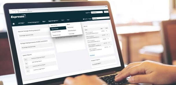
Here’s a glimpse of Expresso’s new look and feel:
You’ll notice clean lines and a crisp display. More than 60% of Americans have digital eye strain from excessive computer screen use, so we’ve opened up Expresso’s pages with added white space and enhanced its color palette with serene, desaturated colors.
THEN
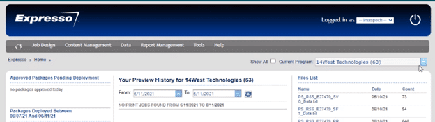
NOW
Some of the changes are subtle, but all are impactful.
We’ve linked thought to action by replacing most of the screen icons with buttons that state the action in a word. A button labeled “Save” replaces a floppy disk icon, and so on. We added a few globally recognized icons: A binoculars icon allows a page peek. A red trashcan replaces the large red X.
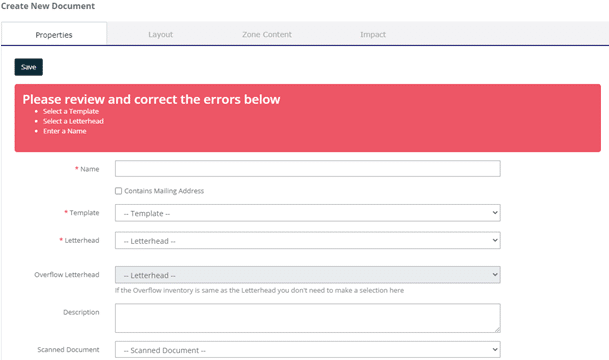
Error notification
Input errors are now detailed in a red box that appears at the top of the page. We chose red because it’s highly visible, and semantically speaking, red means “Stop!”
As you make corrections, the notification box remains as a visual prompt. In the past, the error note was a clear popup that you’d have to close before making the fixes. Then open again if you could only recall two of the three items listed… and then close again to get to the live page for corrections. Frustration eliminated!
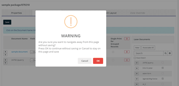
Pop-up messaging
We made Expresso’s pop-up notification more visually striking. Previously, the pop-up design defaulted to the user’s web browser application, rendering messages indistinct and easy to overlook. That could lead to an unintended action or cause you to lose your work by navigating away without saving.
This change also demonstrates another design best practice: By obscuring the background details, which we do with color by “greying” out the rest of the page, you can guide eye flow, helping the popup, POP.
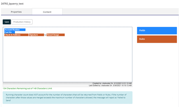
Information sections
We’ve standardized the consistent placement of these callouts. Information sections now appear near the top or bottom of a page, set off by an aqua-colored box. This is an example of a serene color choice. Fully saturated colors, like the red of the error notification box, almost vibrate on the page. Pastels and shades of colors may boost readability while giving your eyes a break.
What’s next for Expresso
We’ll continue to expand the Expresso communications management and payments platform, adding services and enhancing the most popular functions and features.
In July, we’re excited to launch a new Dashboard platform. This is in line with our goal to enhance Expresso and make it a more intuitive and personal experience. The Dashboard will allow Expresso to introduce a new way to communicate to users by allowing them to select data widgets that are meaningful to them and disassociate the ones that are not helpful to their role. The Dashboard will allow us to grow a data widget library, via future releases, for users to select and place on their personalized Dashboard. We can’t wait to see how your creativity will translate to your Dashboard.
The customer experience – YOUR experience – is at the heart of these design updates. We want to provide the best digital experience to meet your needs and preferences. Tell us what you think, and what we should think about for future enhancements.
If you’d like to discuss how to make the most of these features, we can help. Please contact us.