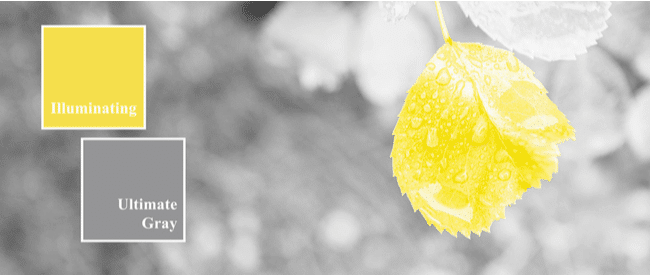
It’s always fun to see which color the visual gurus at the Pantone Color Institute select for Color of the Year. This year, we have two colors: Ultimate Gray and Illuminating Yellow.
Pantone says it chose two colors to “highlight how different elements come together to support one another.” Ultimate Gray stands for feelings of composure, steadiness and resilience while Illuminating Yellow represents brightness, cheerfulness and vivacity.
Yes, sounds like this color duo will support everyone in 2021 as we work to recover from a global pandemic and economic downturn.
Color Your Communications
Each year, Pantone’s Color of the Year pops up in fashion, beauty, home décor, advertising and packaging. While the annual color choice doesn’t always translate precisely to customer communications, the emphasis on color to drive engagement and promote certain emotions and actions in customer documents certainly does.
A specific color doesn’t always convey the same emotion to everyone, but we’re all familiar with some common feelings about specific colors. While red can stand for love and passion, if you say, “I am seeing red,” you mean I’m angry.
The color blue can convey trust. But if you say “I feel blue,” you mean “I’m sad.” Then there’s “once in a blue moon,” which means a rare event.
If I am jealous, I might say, “I’m green with envy” — perhaps because green is the color of money. But if you give a project the “green light,” it means it’s a go. Yellow often makes you feel downright sunny and joyful. Orange can evoke fun and playfulness.
Color for Function
For billing statements, collection letters, welcome kits, appointment confirmations, payment reminders and more, color can:
- Bring attention to specific text or buttons
- Direct the flow through the document
- Add emphasis to messaging
- Create actual structure or organization within the document
- Provoke customers to respond to a call to action – from making a purchase to paying a bill
- Improve the readability and customer experience
Before adding or expanding the use of color to your critical customer communications, we recommend that you start with a quick audit of current documents and marketing materials across all customer touchpoints. Gather a sample of each e-statement, customer letter, other digital and print communications and marketing materials. Review to determine if they employ a cohesive look that makes it clear the communications were created by the same company or organization.
- Are the font styles and text and headline sizes complementary?
- Is the style of the graphics, infographics and other imagery the same or similar?
- Are you using color consistently across documents, including in your omnichannel billing and payment portals, so the customer experience appears seamless?
- Are you correctly applying your corporate branding in every case?
Affordable and Personalized
Technology has made color communications eminently affordable and endlessly customizable, by segment or even by individual. Full-color, high-speed variable printers produce custom print communications for nearly the same price as black-and-white. And color doesn’t cost extra for digital communications, of course.
We can help you take advantage of color in your critical customer communications. Contact us to get started.