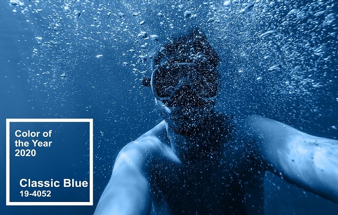
The Pantone Color Institute has been naming a Color of the Year for 20 years, and for 2020, it’s Pantone 19-4052 Classic Blue. This blue hue is suggestive of the sky at dusk, Pantone says, and can evoke feelings of peace, clarity, reassurance and protection.
Each year, Pantone’s Color of the Year sets the tone for color in the world of fashion and home design, packaging and even business communications for both print and digital. In 2019, it was Living Coral, which we chronicled in a post about this time last year.
This year, blue reigns supreme, and not only according to Pantone. Sherwin-Williams’ 2020 Color of the Year is a darker blue called Naval, saying the color “creates a calm and grounding environment infused with quiet confidence.”
These color experts seem to be telling us we need a little calmness in our lives in 2020!
Color Makes Your Customer Communications a Stand-Out
Celebrating Pantone’s Color of the Year is also a great opportunity to showcase the benefits of color in print and digital customer communications.
When sending communications to customers, from billing statements to marketing materials, it’s important to understand the role that color plays in catching the human eye. That’s because color can be used to direct the eye to text that’s important, such as product benefits or the total amount due on a bill. Color also boosts readability, comprehension, retention, and engagement — so customers take the desired action, whether it’s paying on time or signing up for a service.
Incorporating Color into Your Communications
Should you hop on the Pantone’s color of the year bandwagon? The color blue frequently tops surveys of personal color choices, and words often associated with the color blue include trust and dependability, qualities that companies want connected to their brands. Not surprisingly, many of the world’s most successful companies – American Express, Facebook, IBM, JPMorgan Chase, PayPal and United Airlines — use blue in their branding.
Whether you “go blue” in your customer print and digital communications for 2020, or choose other colors, here are a few principles to keep in mind:
- Choose a color that complements your brand identity and values.
- Create a brand guideline document that gives direction on how and when to use color so you can be consistent.
- Select colors for billing statements and other communications that reinforce specific emotions or action steps. For example, red is often used to generate a sense of urgency, such as for a due date.
When you’re ready to make a splash with color, Nordis Technologies can help. Nordis offers both full-color high-speed variable printing and color laser printing, so we can work with you to determine the best fit for your programs. Please contact us to assist with planning for a colorful year in customer communications.
About the Author
Bryan joined Nordis Technologies in 2016 to manage and grow the company’s already-large vacation ownership client base. He also is responsible for business development and market expansion in the healthcare and financial services markets. Before joining Nordis, Bryan spent more than 21 years with Interval International, a leading global provider of vacation ownership services. Bryan graduated from Northwestern University with a bachelor of science in political science.

Bryan Ten Broek
Vice President, Business Development